

Lands on the homepage
Find clothes and outfit ideas for a summer trip.
Finding something you love shouldn’t mean choosing between your style and your values. I reimagined EcoStylist’s shopping journey to help conscious shoppers move from inspiration to a confident purchase.

I mapped the shopping journey, explored navigation and page layouts, and built a prototype to test a simple goal: help our main user, Sophie, find a dress she feels good about buying. This project took me from early sketches through usability testing and a high-fidelity concept.
EcoStylist helps people discover brands vetted for transparency, fair labor and environmental impact. That reassurance matters. But a shopper still needs to picture the clothes in their own life.
In the journey I reviewed, the mission was easy to find; the shopping path was harder to follow. Product links sent people to other retailers, breaking the experience just as they were ready to buy.

I explored the existing EcoStylist site myself, then walked through it with shoppers during early interviews. Sophie is a persona built from the needs and frustrations those shoppers shared. Her search for a summer dress brings their experiences into one journey, showing where browsing started to feel like hard work. You’ll meet her in more detail below.
Find clothes and outfit ideas for a summer trip.
Find a dress that fits her style, with filters that help narrow the choice.
Read the details, check availability and decide whether to buy.
Buy a dress she likes without having to start over.
Finish shopping somewhere that feels familiar.
These three takeaways connect the walkthrough with what shoppers shared in my FigJam research notes. Hover or tap a card to read the comment behind each idea.

Sophie, a persona based on shopper interviews
Problem statement
Sophie wants a dress she loves and can buy with confidence. Limited filters, missing product details and retailer redirects make that simple goal harder than it should be.
How might we help Sophie find clothes she loves, understand what she’s buying, and complete her purchase without losing confidence along the way?
The direction became three connected promises: inspire her to browse, give her the information to choose, and keep the path to purchase coherent. Sustainability should strengthen that experience at every step.
Across the platforms I explored, a few ideas kept making shopping feel easier. I brought these together around the decisions Sophie needs to make: what to wear, how to choose, and how to finish her purchase.

Show complete looks so a shopper can picture how a piece fits into their wardrobe.

Let people narrow the choice by what they want to wear and what matters to them.

Make size, materials and quality easy to understand so shoppers know what they are choosing.

Other shoppers’ experiences help people judge how a piece feels and fits before committing.

Give shoppers a place to collect favorites and return when they feel ready.

Let people finish their order as a guest, with fewer obstacles between choosing and buying.
I used a card sort to see how people grouped the global and local navigation. Most followed the site’s initial structure. That suggested I could keep the familiar groupings while making the way into shopping clearer.
Shopping is tucked inside one Shop link, so people have to open a menu before seeing where to begin.
The nested menu hides choices behind another level. The card sort suggested the familiar groupings could stay.

Scroll to follow the numbered points ↓
Women, Men and Sales move into the main navigation, making the first shopping choice visible right away.
Clothing, accessories and collections sit in a scannable menu, keeping familiar categories while giving them more room.
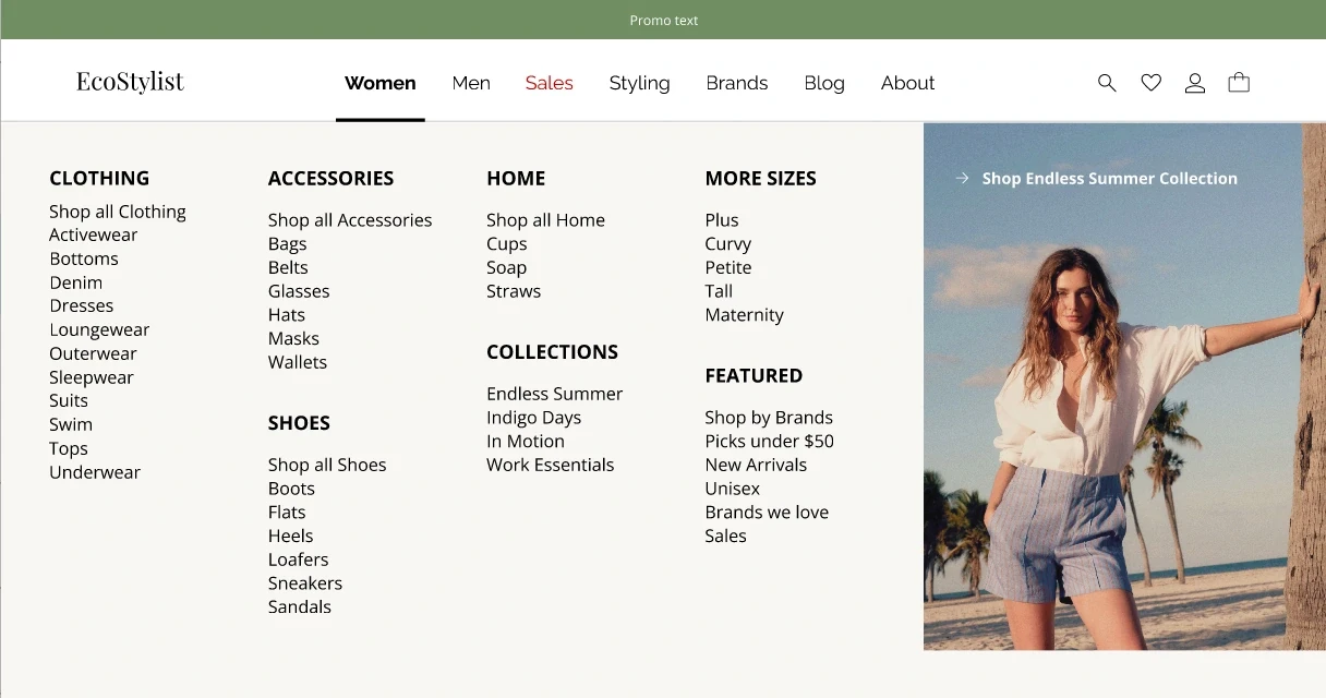
Scroll to follow the numbered points ↓
The familiar categories stay. Clearer entry points and a wider menu make them easier to find.
Solution statement
Bring discovery, useful product details and checkout into one clear journey, so Sophie can find a dress she loves and feel confident buying it.
The task was specific: buy the Embroidered Sun Dress in Sand/Creme, size Medium. I mapped the decisions Sophie needs to make, then connected them in one proposed shopping journey.
Browse womenswear
Choose summer dresses
Find the embroidered dress
Check fit, reviews and details
Select Sand, size Medium
Add the dress to the bag
Enter contact, shipping and payment
Confirm the order
This unified checkout is a concept. Bringing it to life would require agreements and reliable inventory connections with EcoStylist’s retail partners.
I sketched the pages around the decisions a shopper needs to make: what catches their eye, what helps them choose, and what they need to finish the purchase. Explore the original drawings beside the digital wireframes, then open either view for a closer look.

One scrollbar moves both versions. You can also scroll over either screen.
I started with inspiration and clear ways into the shop, then gave those ideas enough structure to test.
Three people tested the low-fidelity purchase flow. All reached the end, but completing a task isn’t the whole story. Their feedback showed where the experience still asked for too much effort, or left the next action unclear.
I kept the visual direction fresh, clean and earthy. Soft greens and natural textures support the clothing photography, while an editorial serif gives the experience the feeling of a thoughtfully curated wardrobe.
Open Sans keeps product details clear and comfortable to read.
Playfair Display · Raleway · Open Sans
Forest
#2F3C2A
Olive
#506546
Sage
#8DA582
Soft leaf
#D3DCCF
Mist
#F1F4EF
Sophie can start with the clothes, explore a style that catches her eye, and look more closely before committing. The visual design gives the products room to breathe; the journey keeps her next step in view.
Take a closer look at the product page, or open the prototype to follow Sophie’s purchase flow from browsing to checkout.

This project reminded me how easily a large redesign can turn into a collection of screens. Returning to Sophie’s task helped me decide what deserved attention: the moments where she needed inspiration, reassurance or a clear next step.
Testing early also changed what I noticed. A completed task can still contain hesitation. The quick-add and Continue Shopping feedback were small details with a direct effect on how confident someone feels.
I’d ask shoppers to find a dress, choose their size and add it to their bag, then keep browsing before checking out. I’d watch whether they understand “Add to Cart” and “Continue Shopping”, and whether the revised checkout reduces hesitation. Their questions would show me what to simplify next.
Have a shopping experience to improve? Let’s design it together.
